|
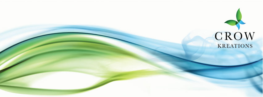
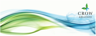
CrowKreations determined that a re-branding was needed in order to convey a better understanding of what we do. It was important that our creative side be shown. We envisioned a butterfly as a symbol of wellness and healing, which we so strongly believe in. And an artistic "swoosh" was also part of our vision. We also wanted to use calm and cool colors to represent peace and prosperity. The end result is shown here:
Tell us what you think in the comments.
1 Comment
|
Details
|
Websites | Social Media | Email Marketing | Graphic DesignHome | About | Specialties | Our Portfolio
|
CrowKreations | Bryson City, NC 28713 | 828.246.2712 | Email | Copyright 2009 - 2020 , All Rights Reserved
